 http://upload.wikimedia.org/wikipedia/commons/3/38/Star_plot.gif
Star plots is a way of showing multivariate data in the form of a 2-D chart of 3 or more quantitative variables which are represented on axes starting from the same point.
http://upload.wikimedia.org/wikipedia/commons/3/38/Star_plot.gif
 http://yin.che.wisc.edu/images/ProteinMatrix.jpg
 http://www.fxpal.com/systems/MediaAnalysis/sim10000.gif.
 http://www.uow.edu.au/student/attributes/statlit/modules/images/2_31.gif
 http://www.statmethods.net/graphs/images/boxplot2.jpg
 http://www.statcan.gc.ca/edu/power-pouvoir/ch9/images/histo1.gif
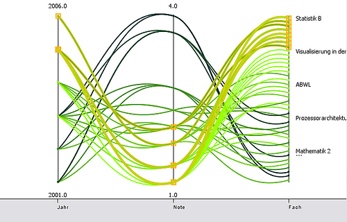 http://informationandvisualization.de/files/parallel_curves_m.jpg
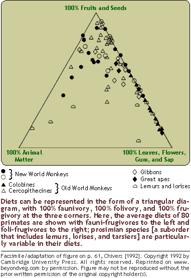 http://www.beyondveg.com/billings-t/comp-anat/chivers1992p61.gif
 http://www.uwsp.edu/geo/faculty/ritter/images/atmosphere/climate/climographs/memphis.jpg
 http://www.envcomm.act.gov.au/soe/soe2004/YassValley/Graphs/population2.gif
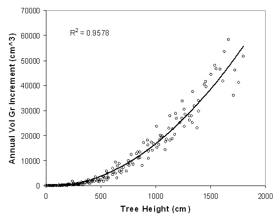 http://www.ruraltech.org/pubs/working/ft_lewis/images/fig_02.gif

 http://www.mathworks.com/products/demos/shipping/garch/garchcopulaevtdemo_01_thumbnail.png
 http://en.wikipedia.org/wiki/File:Lorenz-curve1.png


 http://upload.wikimedia.org/wikipedia/commons/thumb/7/78/USA_states_population_density_map.PNG/800px-USA_states_population_density_map.PNG
 http://proceedings.esri.com/library/userconf/proc99/proceed/papers/pap171/p1712.jpg

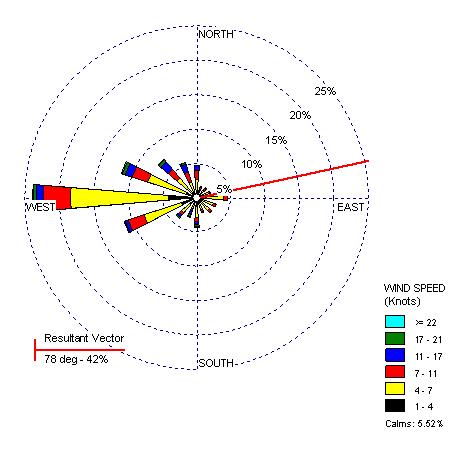
 http://personal.uncc.edu/lagaro/2101/2101_ProjectsS2001/beefmethaneJMK.gif
 http://www.neiu.edu/~jrthomas/377/circle.jpg

 http://upload.wikimedia.org/wikipedia/en/c/cd/Oregon_DEM_relief_map.gif
 http://www.goldensoftware.com/newsletter/50/Issue50Sgps5.gif
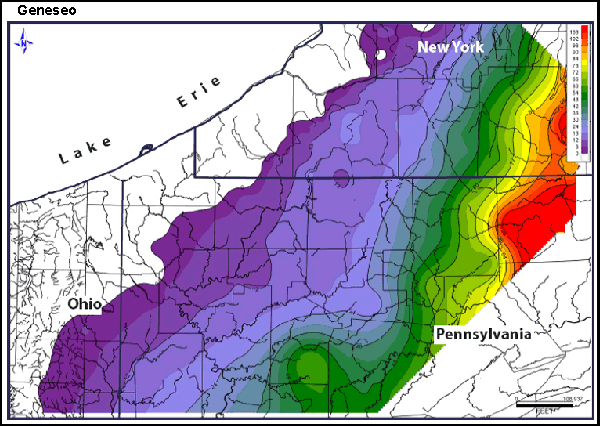 http://www.searchanddiscovery.com/documents/2007/07022lash/images/ani03.gif
Isopachs are contour lines of equal thickness. An isopach map illustrates this thickness with a stratum. This map shows Geneseo Shale (thickness is measured in feet).


 http://www.nps.gov/lyjo/naturescience/images/LBJRanchAerial95.jpg
 http://uwacadweb.uwyo.edu/JSHINKER/animations/global/gifs/vmag500winds_web.gif
 http://personalpages.manchester.ac.uk/staff/m.dodge/cybergeography/atlas/landweber_version_16.gif


 Proportional Circle Map show pie symbols to represent quantifiable data which is proportional to the amount represented relative to other symbols of the same type on the same map. The symbols in this map represents major industries in Germany.

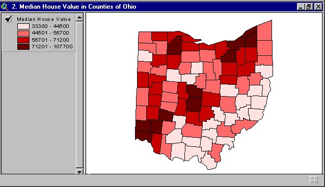
 Choropleth maps have areas that are shaded in proportion to the measurement of statistical variables, such as population density. This map is from the Department of Agriculture which gauged the acres of hay in the United States in2002.
 Propaganda Maps are used to incite emotions in others towards a particular cause. Hitler believed that it was the manipulative power over one's emotions that would be of an enormous value to him. Propaganda maps have also been used to extend ideas to the illiterate masses. This map was created by the French to show the ports and shipping centers that were bombed by the Luftwaffe.
 Hypsometric maps are maps that show elevation by contours or through shading, tinting or batching. This is a map of Hawaii showing the island and the varying elevations.


