
Continuously variable proportional circle maps utilize circles to create point data. The circles are in proportion to the variable being measured. This map is obviously of Canada. The circles represent the population distribution in 1980.

 http://upload.wikimedia.org/wikipedia/en/c/cd/Oregon_DEM_relief_map.gif
 http://www.goldensoftware.com/newsletter/50/Issue50Sgps5.gif
 http://www.searchanddiscovery.com/documents/2007/07022lash/images/ani03.gif
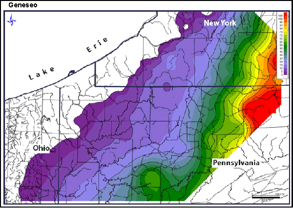
Isopachs are contour lines of equal thickness. An isopach map illustrates this thickness with a stratum. This map shows Geneseo Shale (thickness is measured in feet).


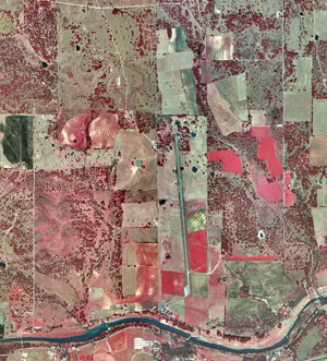 http://www.nps.gov/lyjo/naturescience/images/LBJRanchAerial95.jpg
 http://uwacadweb.uwyo.edu/JSHINKER/animations/global/gifs/vmag500winds_web.gif
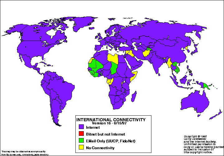 http://personalpages.manchester.ac.uk/staff/m.dodge/cybergeography/atlas/landweber_version_16.gif


 Proportional Circle Map show pie symbols to represent quantifiable data which is proportional to the amount represented relative to other symbols of the same type on the same map. The symbols in this map represents major industries in Germany.

 Choropleth maps have areas that are shaded in proportion to the measurement of statistical variables, such as population density. This map is from the Department of Agriculture which gauged the acres of hay in the United States in2002.
 Propaganda Maps are used to incite emotions in others towards a particular cause. Hitler believed that it was the manipulative power over one's emotions that would be of an enormous value to him. Propaganda maps have also been used to extend ideas to the illiterate masses. This map was created by the French to show the ports and shipping centers that were bombed by the Luftwaffe.
 Hypsometric maps are maps that show elevation by contours or through shading, tinting or batching. This is a map of Hawaii showing the island and the varying elevations.


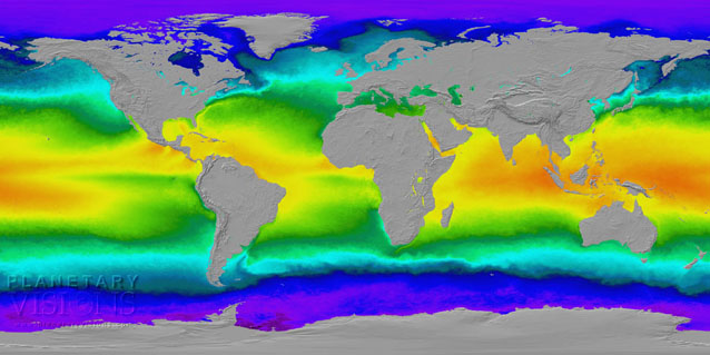 Thematic Maps are maps that reflect a certain theme of an area. Thematic maps are used to show vegetation, land use, soil type, etc., by using different colors or patterns. This map shows the surface temperature of the ocean through color-coding.
map shows colour-coded ocean surface temperature based on satellite observations

Topographic maps use symbols and coloring to show attention to the various shapes of an area. Relief is shown through the use of contour lines. This is a map from the US Geological Survey. They began producing topographic maps in the 1880's. This map was taken in 1915 of the San Francisco Bay area.


 Mental maps are a guide of the paths we go through in life. These soldiers are looking at the map for what? who to conquer next? Carving our their piece of the world? The dimensions of a country may be influenced by war coverage through the media or through the person's own perception of how they see the size of their country.