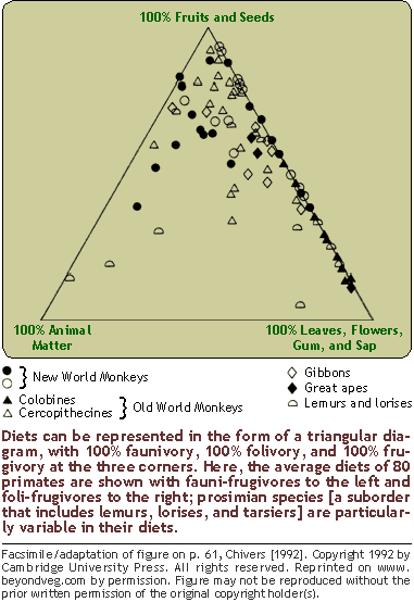
 http://www.beyondveg.com/billings-t/comp-anat/chivers1992p61.gif
Triangular Plot shows the ratios of 3 variables as positions in an equilateral triangle. This plot shows the average diet for 80 primates.
http://www.beyondveg.com/billings-t/comp-anat/chivers1992p61.gif
 http://www.uwsp.edu/geo/faculty/ritter/images/atmosphere/climate/climographs/memphis.jpg
 http://www.envcomm.act.gov.au/soe/soe2004/YassValley/Graphs/population2.gif
 http://www.ruraltech.org/pubs/working/ft_lewis/images/fig_02.gif

 http://www.mathworks.com/products/demos/shipping/garch/garchcopulaevtdemo_01_thumbnail.png
 http://en.wikipedia.org/wiki/File:Lorenz-curve1.png